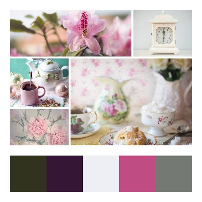
I love colour and can spend ages playing with different colour combinations, but I find that it can be very difficult to narrow down all the different options and come up with a colour scheme that is more than just a unco-ordinated mix of beautiful colours.
If you are serious about using colour in the most effective way and would like to do some research, then I would highly recommend a series of three articles by Smashing Magazine:
- Part 1: The Meaning of Color covers the moods, emotions and symbolism of certain colours e.g. yellow giving a sense of cheerfulness and blue representing calmness.
- Part 2: Understanding Concepts and Terminology defines terms such as “hue” and “tone”.
- Part 3: Creating Your Own Color Palettes introduces some traditional colour schemes based on the colour wheel and links to some online resources for creating a colour scheme.
Another useful resource for guidance on how to use particular colours, as well as for generating palettes based on these colours, can be found at Canva.com/colors.

Using a Colour as a Starting Point
One of my favourite websites for creating a colour palette, based on the colour wheel, is paletton.com.
As an exercise, I used the Paletton website to create some colour schemes based on this blue colour.
Here’s a monochromatic scheme – different tones, shades and tints with the same hue.
Next, I added a complementary colour from the opposite side of the colour wheel.
Adjacent, or analogous, colours are from nearby sections of the wheel.
The scheme that Paletton calls a “triad” seems to be what others call a “split-complementary” scheme.
Adobe Color is an alternative website that provides a similar service to Paletton.
Deriving a Colour Scheme from a Photograph
The Adobe Color site that I mentioned above gives an alternative method for creating a colour scheme – you have the option of uploading a photograph and asking the site to pick colours from that.
You can choose this option from the footer of the website and will be asked to upload your own photograph.

I used the photo below as an example.
Having uploaded my image, I was given the option of choosing from 5 different moods: colourful, bright, muted, deep and dark.
Here are the results using the muted mood:
Some Sites with Ready Made Colour Schemes
A site that has a similar approach to creating colour schemes, in that its schemes are based on photographs, but not ones that you upload yourself is Design Seeds which has some really beautiful palettes to inspire you.
Colour Lovers is another website that is worth visiting if you like to browse colour schemes created by other people.
Canva.com/colors/combinations has some beautiful suggestions.
Coolors is a great way to start with a colour and then quickly access many colour schemes that others have saved that include that colour. Hit the space bar to view a different palette and lock colours to keep them in your scheme.
Here’s an example of just one of the colour schemes that came up when I input the blue colour I used previously.
More Online Tools for Creating Colour Schemes
- https://www.color-hex.com/
- https://color.hailpixel.com/
- https://colorsupplyyy.com/app
- http://colormind.io/image/
Also see my Colour Scheme Options page.


