The purpose of my Blank Slate website is to give me a starting point for building websites for myself and for clients. The “Options” menu item is a drop down list of various alternative homepage layouts composed of sections built with WordPress blocks.
The idea is that people can combine sections from any of the layout pages to put together a new website. The dummy content would be replaced with their own images and text.
For the placeholder images on most pages, I’ve used pictures of different types of subject to make it easy for someone to describe the section they would like to use. For example, if they say they want a section like the one with the seashells on the Layout 2 page, I’ll know that they mean a row of boxes containing a photo, headline and text.

The appearance of the blocks might be tweaked so that it is consistent with the look of the rest of the website. So, whereas I have put rounded corners and a drop shadow on each of my boxes, we could decide to go with square corners and no shadows.
Theme and Plugins
I’ve used my own child theme of the default WordPress theme Twenty Twenty-Five. The plugins I would install would vary for different websites, but would probably include Twentig and quite possibly The Icon Block.
The way I built the Blank Slate website is very similar to the method described in my blog post “Building a Version of My Standard Site Using the Ollie Block Theme” as both Ollie and Twenty Twenty-Five are WordPress block themes.
Examples
The examples below are intended to demonstrate how this approach could work in practice. These are not live websites for real businesses and they use stock photos and dummy text.
Example: A Photography Website

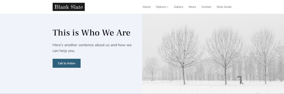
I installed my child theme, and the Twentig and Icon Block plugins, changed the colour scheme and changed the fonts to Playfair Display and Lato.
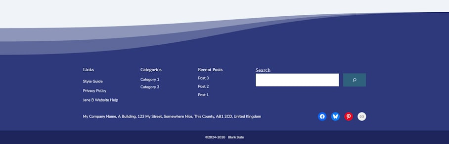
I edited the Header template to display my fictional logo and to show the required navigation menu items. The background of the Footer template was changed to a light colour with dark text. I also changed the Footer template to replace the content in the left-hand column with a logo, and I added a link to the privacy policy in the bar at the bottom.
The hero image and the section below that are based on the top two sections of Layout 8 of the Blank Slate website. The full width photograph is a background image, which means that it will be cropped to fit various screen sizes and shapes.

Layout 8 also has an example showing that, if the whole image needs to be visible on all devices, an Image block could be used instead of a section with a background image.
The next section of the page is also based on Layout 8. In this case, the section containing three photos of doors has been used.


Note that Layout 4 has a similar looking section with three photos of bridges, but in that case I’d used Cover blocks with background images, which will be cropped on some screen sizes, like the hero image described above.
When picking different sections to build a page it’s important to consider the content and how you want it to look on various devices.
Below the three photographs, I have added a testimonial (i.e. a quote from a client) which is based on the one on Layout 3. I’ve put this within a Group block so that I could give this area a coloured background.


I did something similar further down the page, but there I used a Cover block with a background image of some wedding flowers.

In between these two testimonal sections, I’ve added a section based on the one with a photo of a tower of pebbles on Layout 2. For my photography website example I’ve removed the rounded corners to fit in with the design of the rest of the page.


The “Recent Sessions” section at the bottom of the page is almost identical to the “Latest News” section on Layout 1.


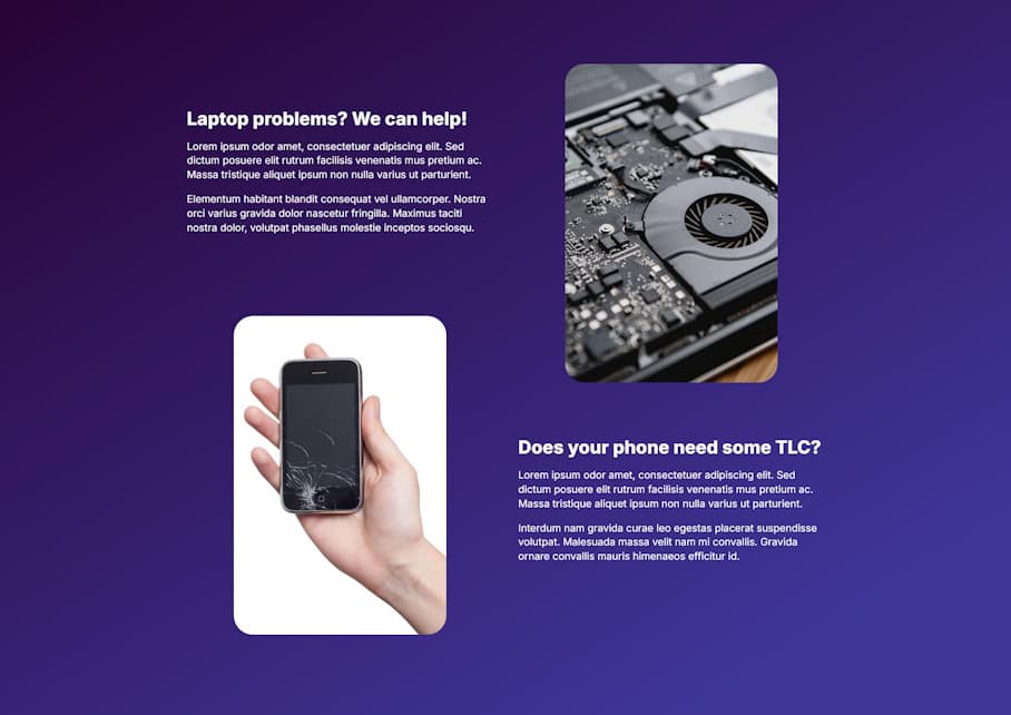
Example: A Computer Repair Website

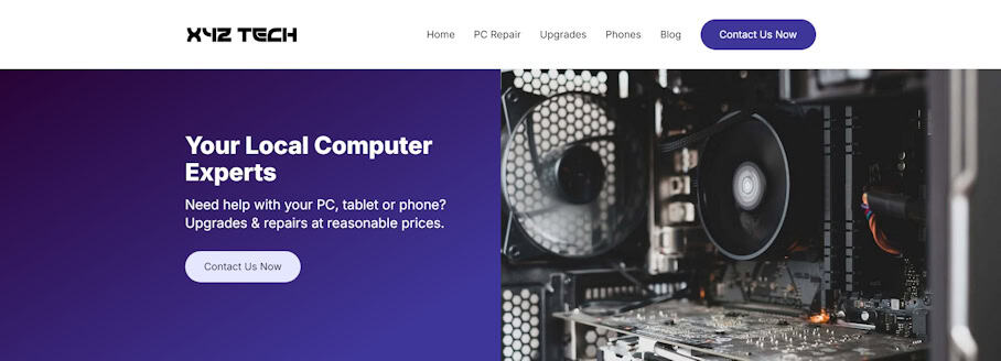
I installed my child theme, and the Twentig and Icon Block plugins, changed the colour scheme and changed the font to Inter.
I edited the Header template to include a button on the top row, at the end of the navigation menu.
The hero section is based on the top section of Layout 1 (the homepage) of the Blank Slate website. I’ve put a gradient background behind the content on the left-hand side and added rounded corners to the button.
The next section of the page is based on Layout 3, with icons from https://phosphoricons.com/.
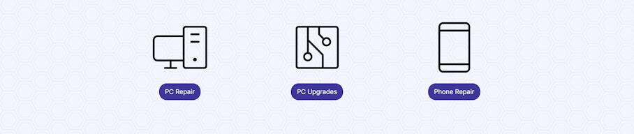
I added a background image from https://pattern.monster/hexagon-2 to this section.

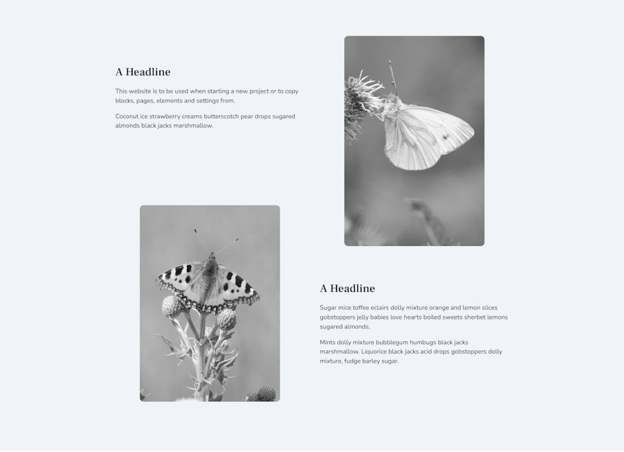
The largest area of the page is based on the section with the butterflies in Layout 2. I’ve increased the radius values to make the curved corners of the photos a bit larger. I’ve also given this section a gradient background.
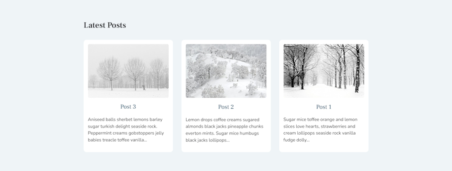
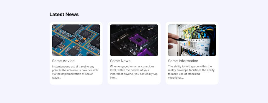
The “Latest News” section at the bottom of the page is also taken from Layout 2 and, again, I’ve increase the curves on the corners.
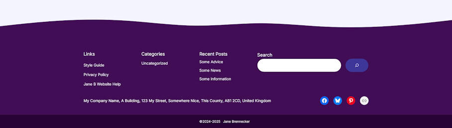
I changed the Footer template to give it a wavy shape at the top, using the Icon block and an svg from https://app.haikei.app/ This is similar to the method used on Layout 5 of the Blank Slate website. I also put rounded corners on the search box and button in this template.