When choosing a colour scheme, it’s important not just to pick colours that you find attractive, but also to think about what those colours portray – see Canva’s article Color meaning and symbolism, 99designs’ article Color meanings and the art of using color symbolism and Smashing Magazine’s Color Theory for Designers.
Ellen Divers points out that there is more to colour than hue. She puts colour into four key categories with certain characteristics:
- Pale – cheerful, light, young, calm, relaxed, soft, friendly, delicate, positive
- Dark – serious, heavy, mature, intense, strong, calm, aloof
- Vivid – energetic, cheerful, friendly, intense, strong
- Muted – relaxed, serious, light, soft, calm, delicate.
Colour Style Variations
The child theme that I use to build “off-the-peg” websites comes with several colour style variations. These can be used just as they are, or used as a starting point and then customised by changing any of the colours. As at the time of writing, these are:
- Default
- Peppermint
- Blackcurrant
- Jelly Beans
- Liquorice
- Chocolate
Default Colours for the Blank Slate website

This is a two colour scheme with shades and tints of blue and green.
Peppermint and Blackcurrant


These colour schemes are based on the example websites that I described in my blog post about my Blank Slate website.
Butterscotch

This could be a starting point if just one accent colour is required. In this particular example the primary colour is too pale for text on a white background so I’ve made the primary dark colour less dark than usual so that it could be used for large text.
Jelly Beans

This is based on the colour scheme that I used for my Standard website. It could be a good starting point if three different colours are required.
Liquorice

This has a dark base colour (used for the background) and white contrast colour (used for text).
Chocolate

This has a pale, but not white, base colour (used for the background). White is included in the scheme as the “Neutral Lighter” colour, in case it is needed.
Some Useful Websites
Figma
Figma’s Ultimate Guide to Colors is an extremely useful resource. Individual colours (purple, for example) have their own pages with a wealth of information, including colours that go well with the one chosen and combinations to avoid.

Figma also has a colour palette generator.
Color Hex
If you have no idea where to start, then you could turn to the color-hex website. This displays some recent favourite colours chosen by their users, and you can also look at popular colours over a longer time period, random colours, or a long list of colours and their names.

For this exercise, I supposed that I’d looked at the information on colour meanings at the top of this page, thought about my target audience and decided that I would like my main colour to be purple.
I opened the random colours page at color-hex and hit the “Generate Random Colors” button until I found a colour that appealed to me.

Clicking on the colour on color-hex took me to a page that gave me a lot of information, including:
- shades and tints
- triadic, analogous, monochromatic and complementary colours
- related colours (in case I wanted to try something similar but a bit different)

Coolors
Coolors is another great website that can be used to generate colour palettes.
Pressing the space bar generates different palettes, and individual colours in a palette can be locked with the padlock icon. This method gave me another purple colour to use.

A useful trick to find lighter and darker variations of a chosen colour is to copy and paste its hex code into each section of the palette, and then use the “view shades” icon (the one that looks like a grid).


There’s a contrast check icon to make sure that the colours can be used with either white or black text.

I also like to check that the light variations of the colour have enough contrast to be used with the three darker shades, using the Learn UI Design Accessible Color Generator.
Pausly’s Oklch Palette Generator
Pausly’s blog post gives a bit of background information about this slightly different method of producing a colour palette.
The online tool can be found at https://palette.pausly.app
I gave the palette a name of “purple”, changed the colour count to 8, and pasted in the hex code I’d used in the Coolors example above, then hit the “Add palette button”.

This gave me a range of light and dark colours, and the export button enabled me to copy their hex codes.

Hovering over the bar containing the palette name would let me duplicate the palette, and clicking on the pinned colour (with the arrow over it) gave me sliders I could use to change the lightness, chroma and hue values.
You can find a similar online tool at https://uicolors.app/create
Canva
Canva has a good online colour wheel, an explanation of various types of colour scheme, and a tool for creating a scheme at www.canva.com/colors/color-wheel/.
When I input the purple colour I’d obtained from Color Hex, it came up with the same colour schemes as that website, but gave me an easy way to tweak the colours using either sliders or the dots on the wheel.

Moving the luminance sliders gave me lighter and darker variations of each colour to use in my design.

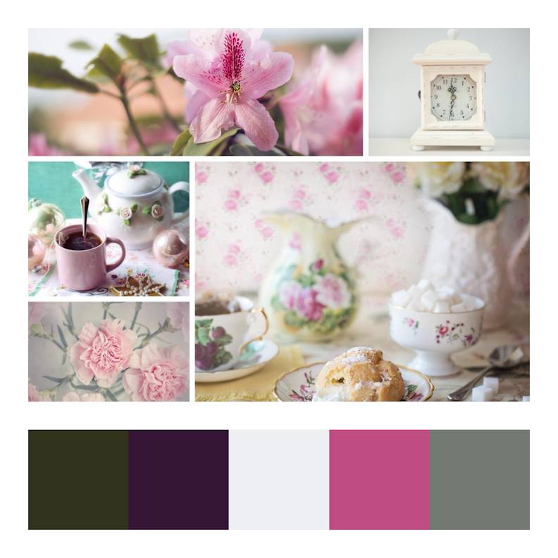
Using Photographs
Another approach is to find a photograph, or collection of photographs, that invoke the feeling you are trying to convey. Here I searched the free stock image site Pixabay using the keyword “beach”, scrolled through the results and chose photos that seemed to have a calm mood.
I used the method that I describe in more detail in my article “Creating a Mood Board with Canva & Coolors” to put three of the calm beach photos in a grid using Canva. Then I used the Coolors image picker tool to come up with a colour palette simply by picking colours that felt “right” to me.


I used the Color Hex website to come up with some lighter and darker variations of some of these colours and used Milanote to make a note of these and give myself a palette with lots of choices.
Milanote is great for this purpose; if you type a colour’s hex code into a note then it automatically becomes a colour swatch.

As I would expect, Pausly’s Oklch palette generator gave slightly different light and dark variations when I tried inputting the same colours. I quite liked this version, but either would be acceptable.

Note that if you want to get inspiration from just a single photograph then you can either upload your own or use Coolors to search directly for one, as it is linked to the free Unsplash microstock site.


Accessibility
To check that colour combinations have enough contrast, from an accessiblity standpoint, you can use the Learn UI Design Accessible Color Generator. If the colours you have chosen don’t meet the guidelines, then this online tool will suggest an alternative.

More Ideas
For more inspiration, see Canva’s articles “100 Brilliant Color Combinations” and “The best website color schemes — and how to choose your own“, the Reasonable Company’s colour sets, and the beautiful colour palettes at Design Seeds.